
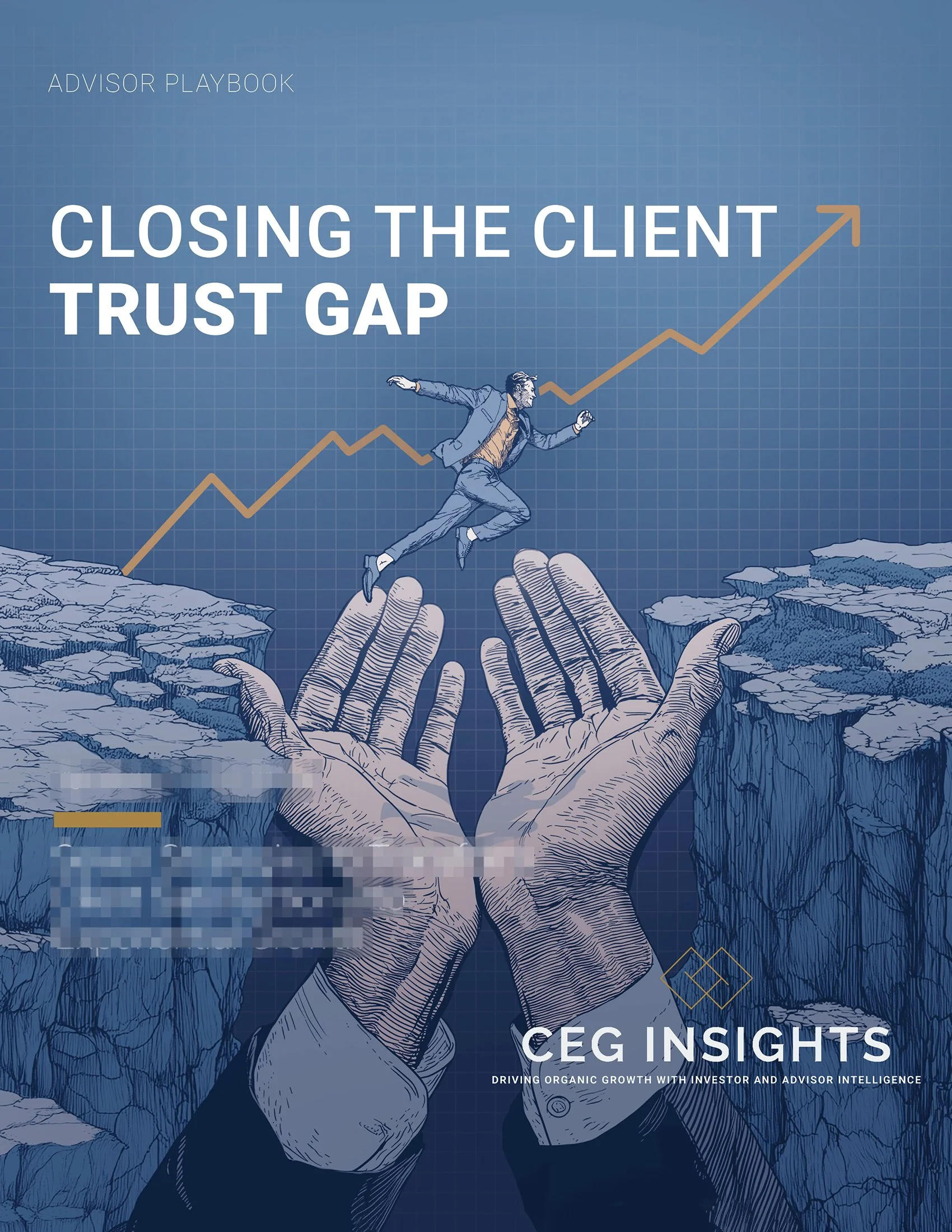
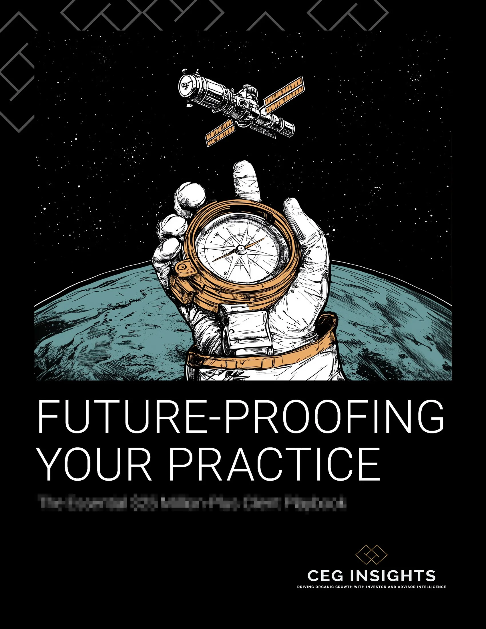
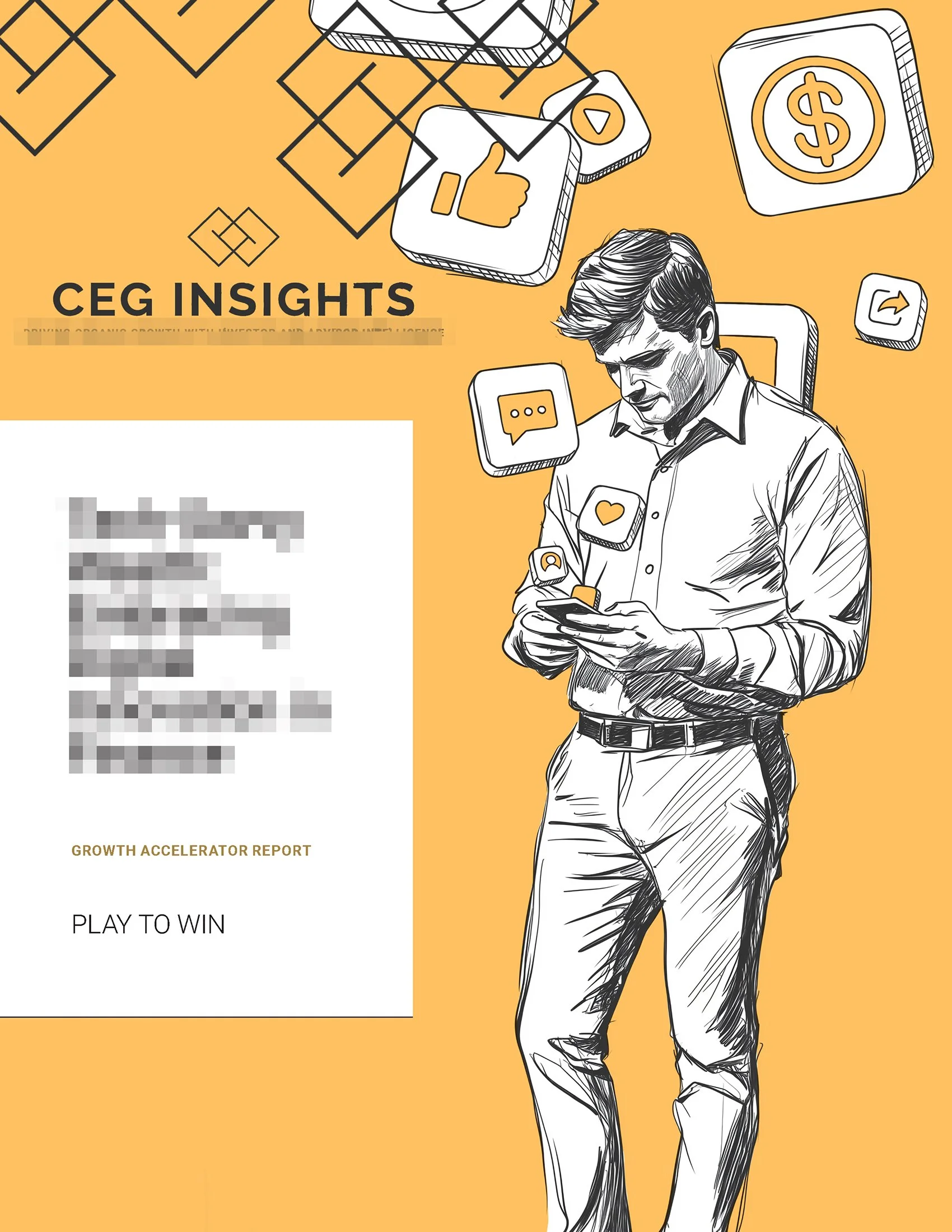
Financial advisors don't need another forgettable training manual. Here's how custom illustrations gave professional development content a visual personality worth paying attention to.
Making the Dry Stuff Interesting
The Challenge
CEG Worldwide publishes monthly journals for financial advisors; dense, analytical content covering business development, client retention, and practice management. The information is valuable. The presentation was not keeping pace with it.
Pages of financial data and industry insight are hard to move through. Not because the content isn't worth reading, but because the human eye needs somewhere to rest. Without visual relief, even the most compelling information starts to blur. Readers skim. Readers drift. Readers put it down.
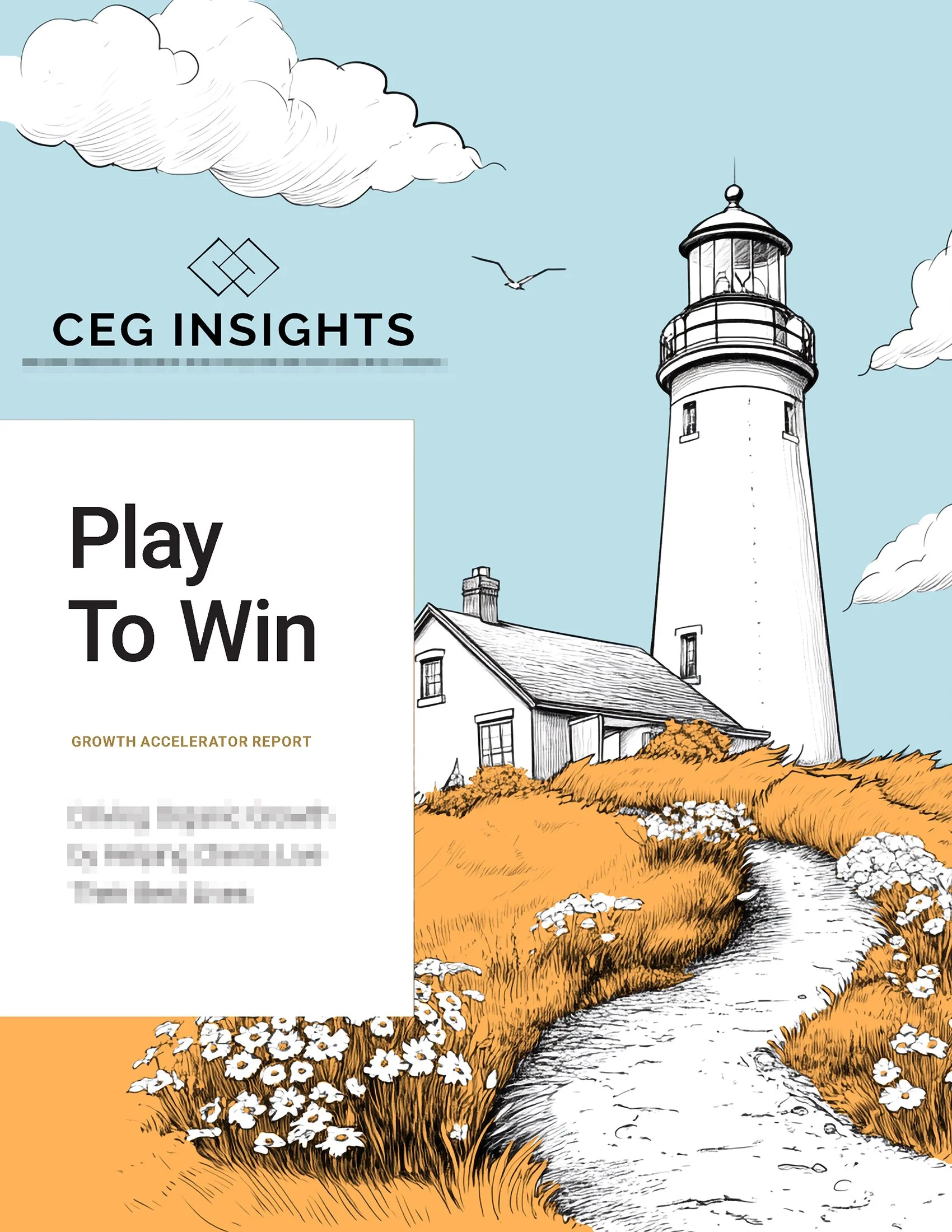
CEG wanted to change that. The goal was illustration: a visual system that would create what they called a pattern interrupt. A moment that breaks the density, rewards the reader's attention, and makes the next paragraph easier to approach.
The challenge was finding a style that felt sophisticated and credible for a professional audience — while still being warm, human, and visually engaging enough to actually do the job.

My Role
I came to this project through a referral from cartoonist Hamish MacDonald, whose work had caught CEG's attention. When his bandwidth ran out he passed select clients my way. CEG became one of them.
My role was to develop and execute a complete illustration system for the journals (cover art, chapter banners, and smaller interior pieces) working within a style that felt distinctive, professional, and original.
Over the course of the engagement I produced illustrations for 13+ journals, each containing between 10 and 20 individual pieces. By the end, CEG trusted me to read the content and develop whatever imagery I felt served it, with minimal direction and minimal revision.
The Approach
The brief called for something specific: sketchy and hand-drawn enough to feel human, refined enough to feel credible in a professional context. I researched illustration styles that lived in that space, pulled together samples, and proposed starting with a single test piece (a journal cover) before committing to a full production approach.
The test was useful. The hand-drawn cover worked well enough to keep, but the process revealed a practical problem. CEG needed volume. Ten to twenty illustrations per journal, on a turnaround that made fully hand-drawn illustration impractical at the required scale.
This was the moment I introduced AI generation; not as a shortcut, but as an honest solution to an honest problem. I told them directly: I can try this route, or you may need to find someone who specializes more in the style you're looking for. They came back impressed that I'd presented the tradeoff transparently, and trusted me to move forward.
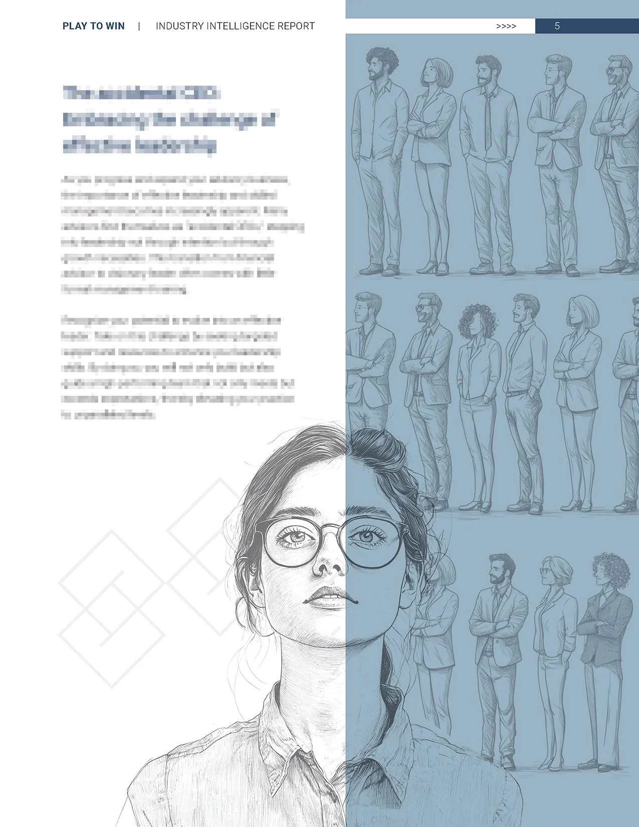
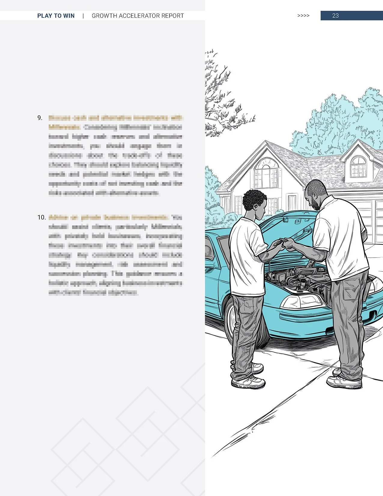
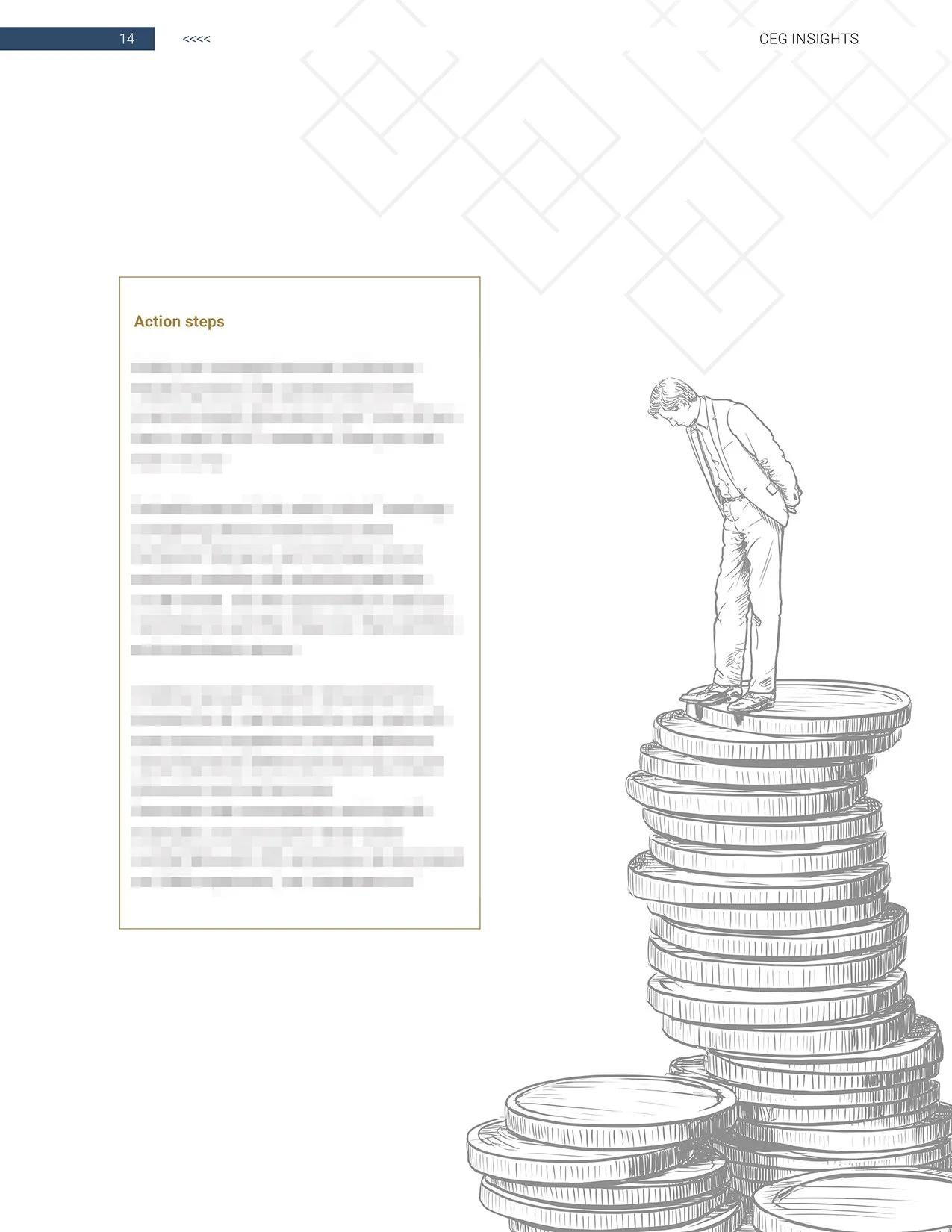
What followed was the same hybrid process I'd developed elsewhere: AI generation for the raw material, my own craft and editorial judgment to get it over the finish line. I developed a signature style: sketchy black and white line work, colorized with a minimalist palette. Each journal got its own unique palette and its own thematic identity.
A cottage-core issue filled with cozy domestic warmth. A futuristic edition with science fiction cities and spacecraft. Most leaned into the aspirational imagery of modern wealth (yachts, estates, generational prosperity) that resonated with the financial advisor audience and the clients they serve.
Early issues involved significant back and forth. By the third or fourth journal the conversation and feedback had largely stopped. They'd read the content, I'd read the content, and my artistic interpretation went through with minor tweaks at most. The trust had been established through consistency.

The Work
Across 12+ journals I replaced generic stock imagery with a cohesive original illustration system that gave each issue a distinct visual identity while maintaining a consistent overall aesthetic.
Every image served a specific editorial purpose; breaking up dense analytical content, signaling chapter transitions, or simply giving the reader's eye a place to land before moving forward. The pattern interrupt CEG had envisioned from the beginning.

The Outcome
CEG continued commissioning journals consistently throughout our time working together; the most reliable signal that the work was doing its job. Direct performance feedback was limited, but sustained volume over 12+ issues in a client relationship that progressively required less direction speaks clearly enough.
What I Learned
This project reinforced something I carry into every client engagement: presenting a creative solution honestly, including its tradeoffs, builds more trust than overselling a perfect answer. Telling CEG directly that AI might be the right tool or they might need a different illustrator was a risk. It turned out to be the thing that made them trust me most.
I also learned something about creative latitude. The early issues were heavily directed. The later ones were almost entirely mine. That progression didn't happen because I pushed for more control. It happened because I consistently delivered work that solved the problem I'd been hired to solve. Autonomy is earned through reliability, not negotiated upfront.
Additionally, the third option is almost always available. When a brief feels constrained or a client's needs seem difficult to reconcile, the answer is rarely to pick a side. It's to go looking for the version of the work that serves everyone's underlying goals without being diminished by any of them.